The Sample Went Green on a North Wall: Choosing Window Colour Out in the Real World
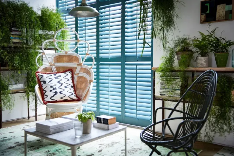
Photo: Shutterworld2020, CC BY-SA 4.0, via Wikimedia Commons
There's a particular moment in every window showroom where someone holds a little square of grey plastic up against a display frame, tilts it slightly, and says "oh yes, that's the one." It's a lovely moment. It's also almost meaningless.
That swatch is about the size of a credit card, it's lit by lights chosen to make kitchens look expensive, and it's sitting in a room with no bricks, no render, no wet November, and no idea what a north-facing back wall actually looks like. Then you get the frames home and wonder why the anthracite you loved at 2pm on a Saturday looks like wet slate on one elevation and traffic-cone grey on another.
None of this is a scandal. It's just physics, plus a bit of sloppy language on quotes. Both are fixable before you sign anything.
Why a small sample can't tell you much
Three things are happening at once when you look at a colour chip. First, it's tiny — your eye compares it to nothing much, so it reads as a clean, pure version of the colour. Second, it's usually gloss-laminated card, not the actual foil or powder-coated aluminium your frames will be made from, and a different sheen changes how much light bounces straight back at you. Third, it's probably tilted. Angle matters enormously with satin finishes.
Put simply: a chip tells you roughly which family of grey you're in. It doesn't tell you what the window will look like. For that you need something the size of a dinner plate, and you need it outside.
Take the sample to the wall
Ask for a proper sample. Most decent fabricators will lend you an A5-ish offcut or a corner section of the actual profile in the actual finish — sometimes against a small deposit, sometimes free. If a company can't produce a physical sample bigger than a business card, that's useful information in itself.
Then do the dull but decisive thing: tape it to the wall next to where the window will go — not to the window itself, and not to a fence — and leave it there overnight. Look at it in the morning before work, at lunchtime, and again at dusk. This is the cheapest design consultation you will ever get.
Your wall is doing half the work
This is the bit people underrate. Window colour is never seen alone; it's seen against a backdrop, and British backdrops vary wildly within one street.
- Red brick pulls warmth out of a grey and can push a dark anthracite towards brown in low sun. It also makes black look very black indeed.
- London stock or pale yellow brick flatters mid-greys and creams, and can leave very dark frames looking like they're floating.
- White or cream render is bright and bounces light back onto the frame, which lifts the colour several notches. Greys read lighter here than you expect.
- Stone and sandstone tends to suit warmer greys and off-whites; cool blue-greys can look slightly cold and municipal against it.
- Pebbledash and roughcast break up light, so the frame's finish matters less and the colour reads flatter.
A window that looks superb on a red-brick semi can look entirely different on the rendered one three doors down. Same frame. Same colour reference. Different job.
North, south, and the hour you actually sit there
Direction changes everything, and it's worth thinking about which room you use at which time rather than treating the whole house as one decision.
South and west elevations get warm, raking light in the afternoon and evening, which deepens dark colours and adds a slight bronze cast to some greys. North elevations get cool, flat, steady light all day, which brings out the blue in a grey and can leave warm greys looking a bit washed out. East elevations get bright, hard morning light that makes satin finishes shine and gloss finishes flare.
So the north-facing kitchen wall you look at every morning over coffee deserves its own sample test. Don't choose it on the strength of a swatch you liked under showroom lights in a completely different room.
Finish is half the colour
Two frames in the same RAL number can look noticeably different depending on how they're made and finished.
A matt or textured foil absorbs more light, reads softer, and hides the odd mark well. It looks heavier and more contemporary. A satin finish sits in the middle and is the most forgiving across elevations. Gloss throws light back, looks sharper and darker in shade, and shows every fingerprint and every smear of coastal salt.
Also ask whether the finish is a laminated foil on a PVC-U frame or a powder-coated aluminium one. They behave differently in sun, they age differently, and the colour reference systems aren't interchangeable. If you're near the coast, salt and UV together are harder on finishes than most of the country has to worry about — worth raising with the surveyor.
Don't forget the trims, sills and cills
A stunning frame with mismatched trims looks like a mistake. Decide deliberately:
- Are the internal trims and architraves colour-matched to the frame, or white? White against a dark frame is a look; it's just not the same look.
- What colour is the external sill? Many installers default to white or black regardless of the frame.
- Are the handles and hardware matched, or deliberately contrasting? Chrome, brushed steel, black, gold.
- If there's a door and a window side by side, are they the same finish and the same manufacturer's range? Two different makes can produce two different versions of the same grey.
Spell all of this out. "Anthracite frame, anthracite external sill, white internal trims, black handles" is a specification. "Anthracite windows" is a mood.
The word "anthracite" is not a colour
Here's the bit that saves arguments later. In the trade, "anthracite" is used loosely to cover a whole family of dark greys — RAL 7016, RAL 7021, RAL 7043 and various manufacturers' own house greys all get called anthracite by somebody. They are not the same. 7016 is a blue-leaning dark grey; 7021 is closer to black; 7043 is warmer and lighter. Put three of them side by side and the difference is obvious.
So when you come to sign the 2026 quote, don't accept the word on its own. Ask for:
- The exact RAL or BS reference — or the manufacturer's own range name and code if it's a proprietary colour.
- The finish — matt, satin, textured, gloss.
- The material and method — foiled PVC-U, powder-coated aluminium, painted timber.
- The matching references for trims, sills and any door on the same elevation.
Then ask for it to appear on the order form, not just the sales quote. The line to look for is something like "colour as per sample ref. X, agreed on site" — with the sample photographed and dated. If the colour arrives wrong and the paperwork only says "anthracite", you've got a conversation on your hands. If it says RAL 7016 matt foil, you've got a position.
A five-minute check before you commit
- Big sample, actual finish, not a card chip.
- Taped to the real wall, viewed morning, noon and evening.
- Both elevations if the house has two very different ones.
- Trims, sills, handles and any adjacent door decided in the same breath.
- Colour reference, finish and material written on the order.
- Asked what the warranty says about colour fade.
Do that lot and the swatch stops being a liar. It just becomes a small square of plastic that you sensibly ignored.